Following proper email signature etiquette can make a powerful impression in someone’s crowded inbox. Yet many professionals either overlook this detail entirely or stuff their signatures with unnecessary elements that distract from their message. A signature that's too cluttered with images, colors and random quotes can undermine your credibility right when you're trying to make a strong professional connection. Crafting a clean and intentional signature is also an opportunity to reinforce your personal brand, presenting yourself consistently across all professional interactions.
Tips for Writing a Great Email Signature and Email Signature Examples
Email signature etiquette: the basics
Most email platforms — including Gmail, Outlook and Yahoo — offer built-in tools to create and customize your signature. You can also use signature generators like HubSpot, WiseStamp and Gimmio to design a polished look.
The most important part of the email signature is your contact information, says business etiquette expert Jacqueline Whitmore. If someone needs to follow up with you, they shouldn’t have to first wade through a large amount of text and images. The essential elements of good email signature etiquette are:
Your full name
Your job title and department
Your phone number (and mobile number, if pertinent)
These elements are optional but often helpful:
Your company name and logo
Your company website address
Your office address
Relevant social media profiles
Your email address (helpful if the message is forwarded)
Multiple signatures for different audiences
One of the fundamental email etiquette rules is tailoring your signature to your audience. One version, for example, could be a comprehensive external signature that includes your full contact details and company information. Another could be a streamlined version with just your name, position and phone number.
Make it mobile-friendly
With more professionals checking email on smartphones throughout the day, your signature needs to work well on small screens. An email signature that looks perfect on your desktop might become a jumbled mess on mobile devices.
Keep these mobile design principles in mind:
Choose standard fonts that display clearly on all devices; Arial, for example
Test your signature on different screen sizes before finalizing it
Use clickable links instead of lengthy URLs
Keep images small and simple
Want to master professional etiquette beyond email? Check out our top 14 tips for making a good impression in your next videoconference.
What to leave out of your email signature
Following proper email signature etiquette rules means knowing what to leave out as much as what to include. When it comes to email signature etiquette, less is more. Here are the elements to avoid for a clean, professional look:
Your handwritten signature — Despite the name “email signature,” yours shouldn’t have an actual image of your signature in it. That’s because extraneous images in emails are likely to trigger spam filters and might not show up in the recipient’s default email view.
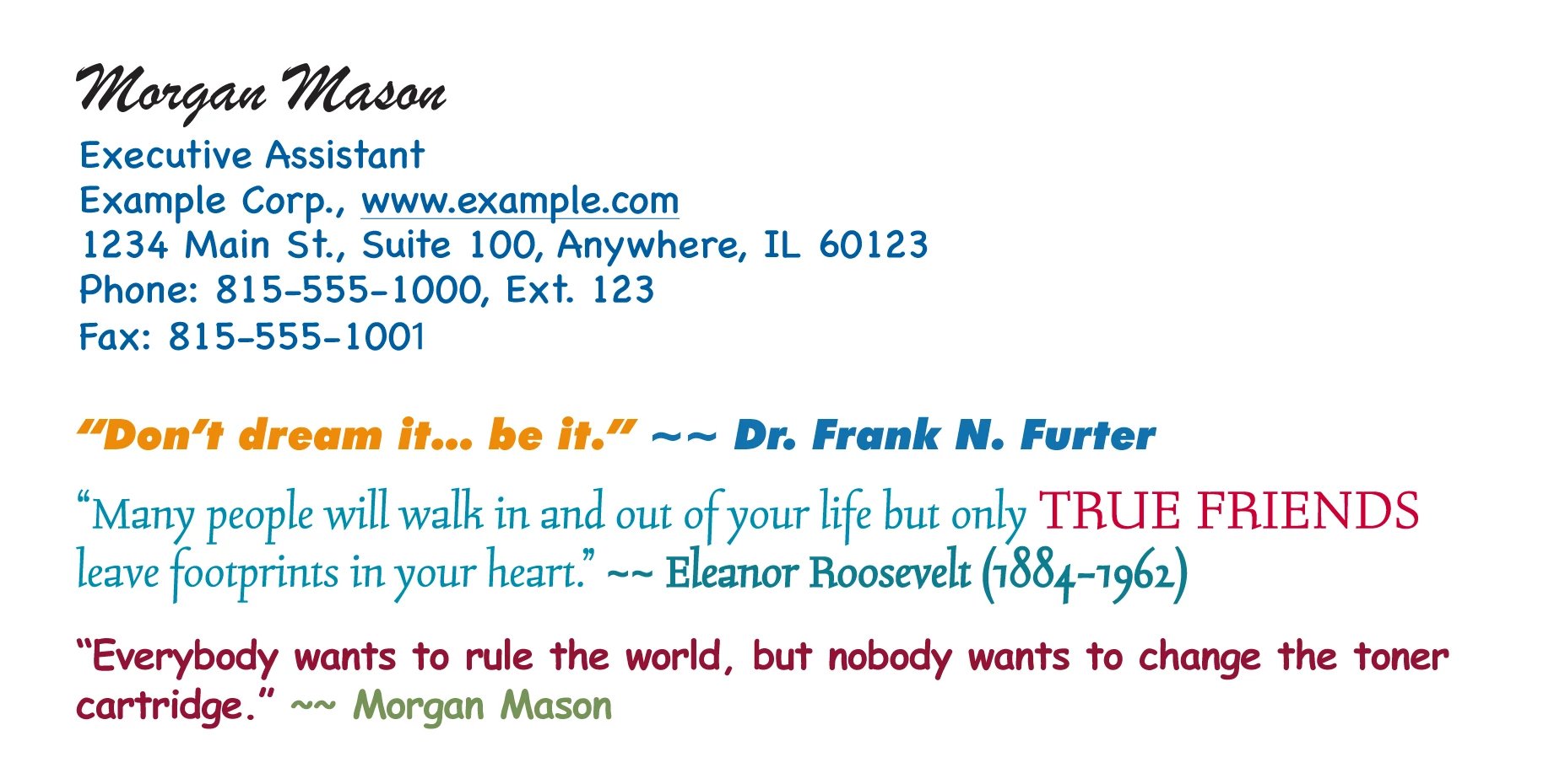
Fun fonts and colors — You might be tempted to spice up your signature with custom colors and fonts, but Whitmore counsels restraint. “I’m not a fan of that because not everybody’s computer will pick up on it. It’s better to keep it simple,” she says. The custom fonts you spent a whole day perfecting, in the best-case scenario, might show up as default text. Worse, the custom colors and font sizes could be illegible on the other person’s monitor. Going overboard with fonts and colors could also come across as unprofessional. Let your personality shine through in what you say rather than in your email signature.
Inspirational quotes — Using these is another common way people try to add personality to their email signatures, but Whitmore advises against them “unless you’re in the inspirational quote business.” Especially unwanted are super long quotes and political or religious quotes — which some may take offense to — if you don’t work for such an organization.
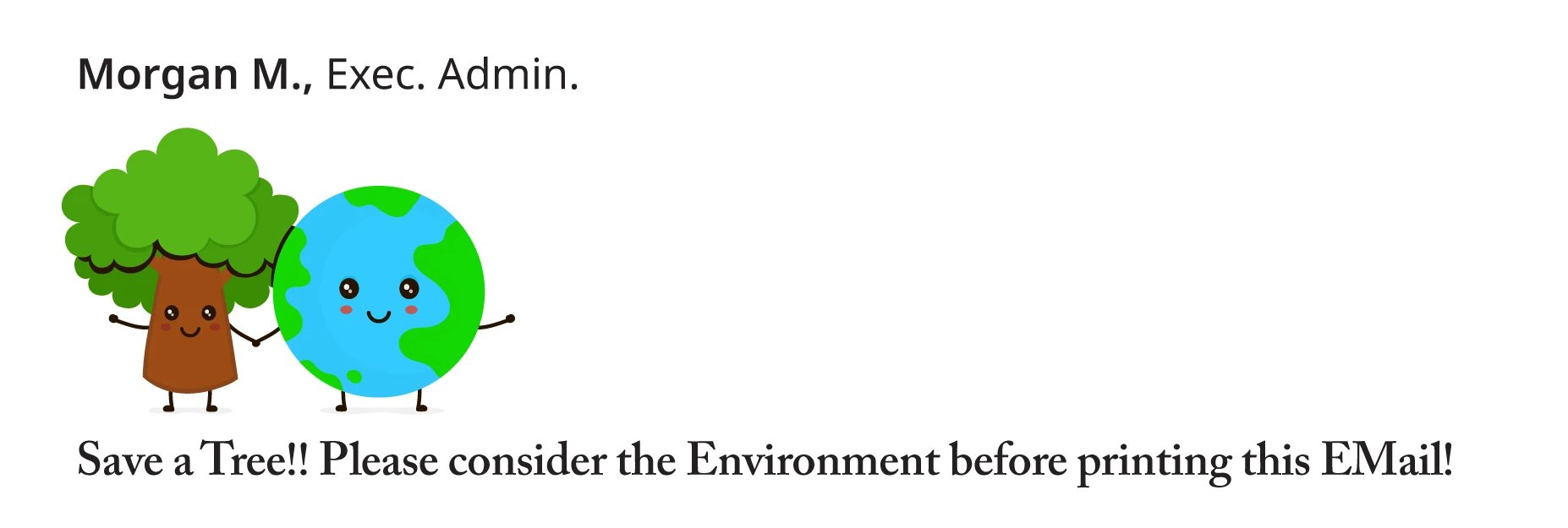
Additional messages — “Please consider the environment before printing this email” is a nice sentiment but just takes up space — plus, you wouldn’t want to come off as preachy to your contacts. The default “Sent from my mobile phone” signature line that shows up in mobile email isn’t helpful either, Whitmore says. And avoid “please ignore any typos.” There’s no excuse for typos. “You should read it and reread it before sending an email,” she says.
Following are three examples of email signatures — the good, the bad and the unnecessary.
Email signature examples
A well-designed email signature should strike a balance between providing essential information and maintaining a clean, professional look. Here are some examples to illustrate what works, what doesn’t, and what elements might be better left out entirely.
A good email signature
This email signature includes all the pertinent details on how to get in touch with the sender and represents the company in a professional way.

A bad email signature
This email signature includes only partial contact information, weird capitalization and unnecessary imagery. All of these elements makes it difficult for readers to glean the sender's essential contact information.

An unnecessary email signature
This email signature starts off with good information but goes off the rails with flashy fonts and inspirational quotes — including one attributed to the sender. Don’t try this at home!

When to skip the signature
Your email platform can automatically add your signature to every message, but that doesn't mean it should. Once you've exchanged a few emails with someone, it's good email signature etiquette to remove your signature from the thread. This keeps the conversation clean and professional without repeated blocks of contact information. Doing this is something many people today fail to do. Most simply hit "reply" without thinking about signature cleanup.
Frequently asked questions
What is email signature etiquette?
Email signature etiquette refers to the best practices for creating professional, clear and effective contact information at the end of your emails. It's about striking the right balance between providing useful information and avoiding clutter.
What file format should an email signature be?
Use plain text or HTML format for your email signature. While you can include a small company logo in JPG or PNG format, keep any images under 10KB to ensure quick loading and avoid spam filters.
What should be avoided in an email signature?
Skip large images, multiple fonts, bright colors and unnecessary disclaimers. Also avoid promotional language, lengthy quotes and personal social media links unless they're relevant to your role.
Robert Half can help you stay up to date on the latest job market trends, spot opportunities and dodge obstacles in your professional path. Subscribe to our newsletter.


